The First Screen of a Corporate Website: What Do Visitors Notice?
When we open a corporate website, the area we see before scrolling gives us several clues. We try to understand what the company does, who it serves, and where we can go next.

The first screen of a website is the visitor's initial point of contact with the page. From the visual identity and headline to the imagery and navigation, several elements come together in this space. How these elements work together can make the website easier or more difficult to understand.
By the first screen, we mean the portion of a page visible without scrolling. However, the boundaries of this area are not the same for everyone. A headline, description, and button displayed on a desktop computer may appear in different positions on a mobile device. For this reason, we need to approach the first screen not as a fixed composition, but as an experience that adapts to different screen sizes.
Without measuring user behavior, we cannot say exactly where visitors look during their first few seconds on a website. However, we can base our design decisions on the fundamental questions people are likely to have. Determining what needs to be understood during the first interaction provides a starting point for the visual structure.
What Questions Should the First Screen Answer?
Not everyone visits a corporate website with the same intention. A potential customer may want to explore services, while another visitor may be evaluating the company's credibility or looking for contact information. The first screen does not need to address all these needs on its own. However, it should provide enough clarity for visitors to understand whether they are in the right place.
When designing the first screen, we focus on three main questions: What does this company do? Why is what it offers relevant to me? Where can I go from here? Sometimes the answers are found in a short headline, sometimes in a supporting sentence, and sometimes in a clearly labeled link. What matters is that visitors should not have to make an unnecessary effort to find them.
For example, seeing only the headline "Shaping the Future Together" on the homepage of an industrial manufacturing company may not be enough to understand its field of activity. A short description explaining which products the company manufactures and which industries it serves would provide more concrete information. We do not have to choose between expressing a brand's character and communicating clearly.
Trying to present every service, reference, and detail about the company's history on the first screen can create a similar problem. Instead of a lack of information, the result is information overload. Separating what visitors need to know immediately from what they can explore later is the foundation of a clear content hierarchy.
The purpose of the first screen is not to explain everything, but to help visitors find the right information.
Content and Visual Hierarchy Guide Attention
When every element on a page is given equal visual weight, visitors may find it difficult to know where to begin. A large headline, a prominent image, a clearly defined button, or an element surrounded by sufficient white space can attract attention. Which one visitors notice first depends not only on the design but also on their expectations and the device they are using.
Visual hierarchy communicates the importance of information through design. Headline sizes, text placement, color contrast, and spacing between elements all contribute to this structure. With a well-established hierarchy, visitors can understand the main message without having to read every element individually.
When evaluating the first screen, we look at how the following elements work together:
Logo: It should help visitors recognize the brand easily without competing with the main message.
Main headline: It should communicate the company's field of activity or primary value clearly and directly.
Supporting text: It should provide information that the headline cannot communicate on its own, without unnecessary detail.
Visual content: It should relate to the message rather than being used simply to fill empty space.
Navigation and links: They should provide clear paths to important sections such as services, products, projects, or contact information.
Making every element larger does not necessarily make it more visible. For example, a long headline placed over a large image may become difficult to read if there is insufficient contrast. Similarly, when several buttons are presented with equal visual weight, visitors may struggle to determine which action to take first.
Bigger Images Do Not Always Create Better First Screens
Large photographs, videos, and animated visuals are frequently used on corporate websites. This approach can be meaningful, particularly for companies that want to showcase physical products, manufacturing processes, or completed projects. However, there needs to be a balance between the space an image occupies and the information it provides.
A photograph of a manufacturing facility can make a company's field of activity more tangible. A software company's product interface can give visitors a direct understanding of the solution being offered. In contrast, a generic office photograph with no clear connection to the company's activities may look appropriate aesthetically but provide little useful information.
We apply a similar approach to moving visuals. Using video is not an advantage in itself; what matters is the information the video communicates and how it affects the page's usability. We need to make sure that motion does not interfere with readability, unnecessarily slow down page loading, or distract visitors from the main content.
Rather than focusing only on creating an impressive visual result, we ask a simple question: If this image were removed, would anything become more difficult for the visitor to understand? If the answer is no, it may be worth reconsidering the image's purpose. Sometimes a smaller, carefully selected photograph can communicate more than a large visual area.
The First Screen Needs to Be Reconsidered for Mobile
A design that feels balanced on a desktop may not create the same experience on mobile. Text and images positioned side by side on a wide screen often appear vertically on a phone. This change affects not only the layout but also the order in which visitors encounter information.
For example, a large product image positioned next to a headline on desktop may move above it on mobile, pushing the supporting text further down the page. As a result, visitors may see only part of the image on the first screen. Similarly, a long headline may wrap across too many lines on a narrow display, reducing the visibility of other important elements.
This is why we do not approach mobile design as a smaller version of the desktop layout. Content order, headline length, image cropping, and button placement should all be evaluated specifically for mobile use. Making sure the main message is easy to read and the navigation is simple to use is particularly important.
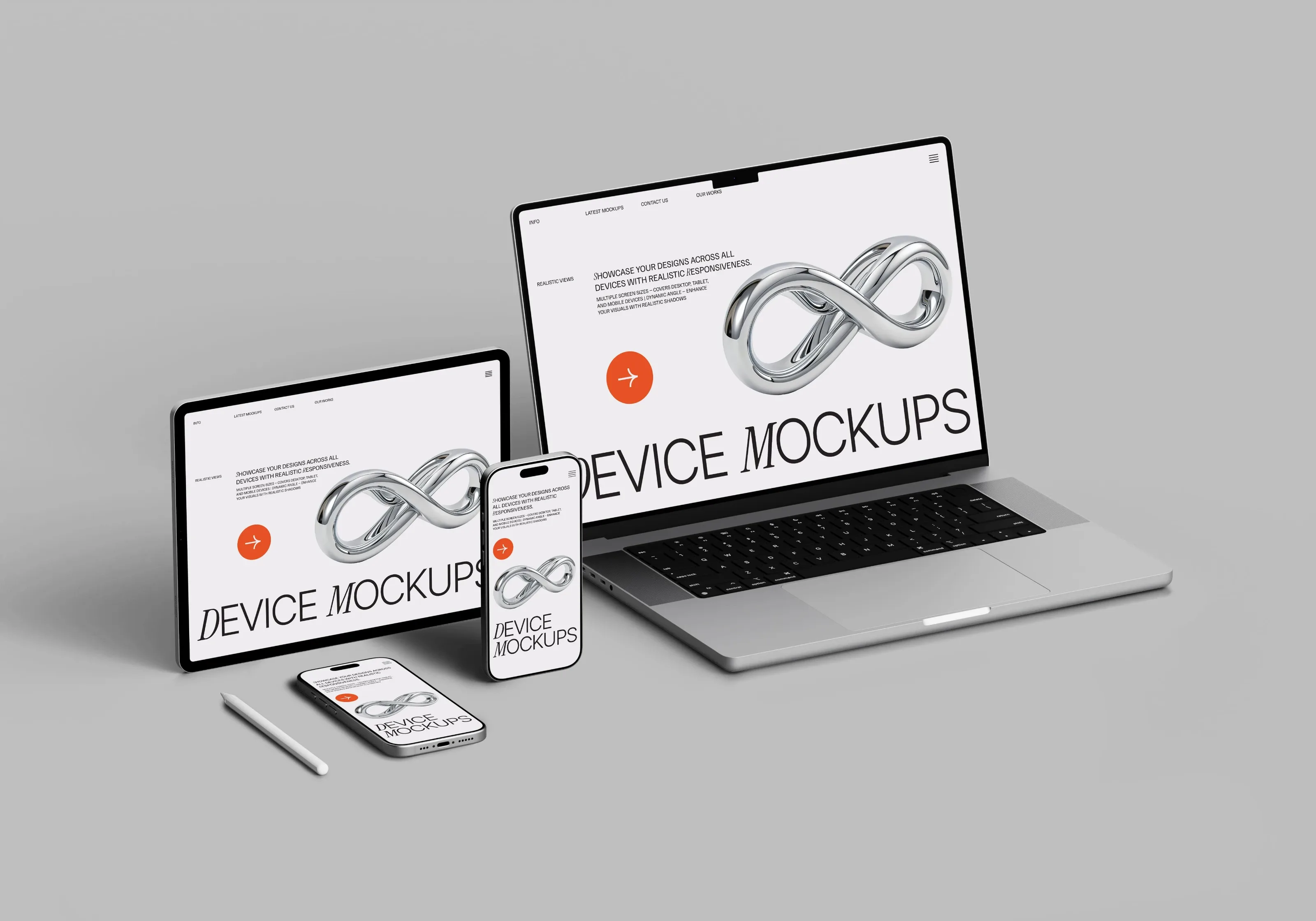
A mobile design needs to function comfortably, not just look good. Clear navigation menus, appropriately sized touch targets, and text that can be read without zooming all contribute to the experience. When evaluating the first screen, we need to consider how it behaves on actual devices rather than relying only on a static design file.
How Do We Know Whether the First Screen Works?
We cannot determine whether a first screen is successful based on its appearance alone. We also need to examine whether the intended message is understood, whether visitors can find the information they need, and whether navigation options are clear. This does not always require a complex research process.
We can begin with a simple observation. We might ask someone unfamiliar with the website to examine the homepage and explain, in their own words, what the company does. We can then ask where they would look for a particular service or how they would contact the company. This approach does not replace comprehensive user research, but it can help us identify areas that are unclear.
For an existing website, properly configured analytics tools can also provide useful insights. Information about which links visitors use, how they move through a page, or whether they proceed to a particular action can help us evaluate design decisions. However, we should avoid interpreting a single metric as definitive proof of success or failure.
At Methodda, we approach the first screen as the beginning of the entire website experience. We pay attention to whether the message presented here is consistent with the content that follows and with the company's broader brand language. After all, the expectations established on the first screen should be supported throughout the rest of the website.
When considering a website redesign, changing the main image or enlarging the headline may seem like the most immediate solutions. Yet sometimes the real need is to reconsider which information should be communicated first. Understanding visitors, prioritizing content, and building the design around these decisions creates a more considered starting point.
Ultimately, there is no single template for an effective first screen. An architecture studio may choose to highlight its projects, while a company providing technical services may need to make its areas of expertise more visible. What matters is that the first interaction accurately represents the brand and makes the next step clear.